Pikka realizes rebranding for the Uetlibergbahn
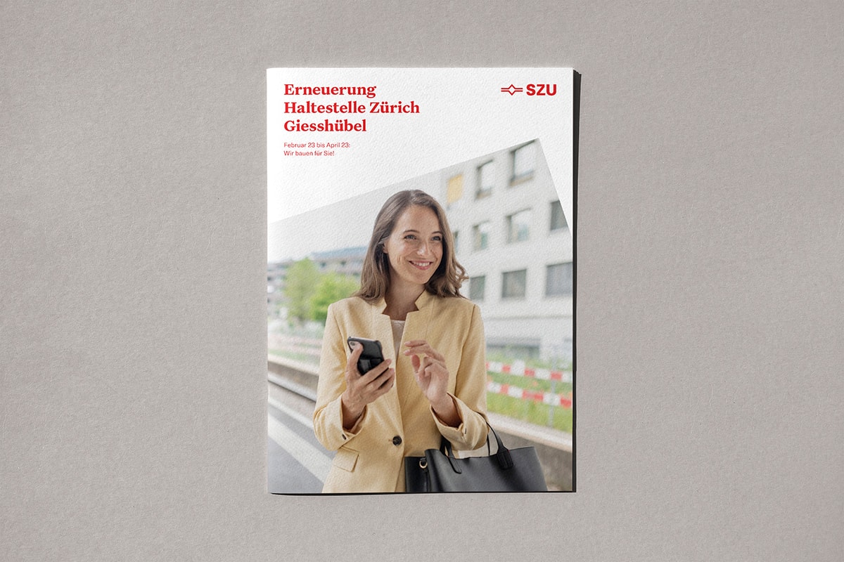
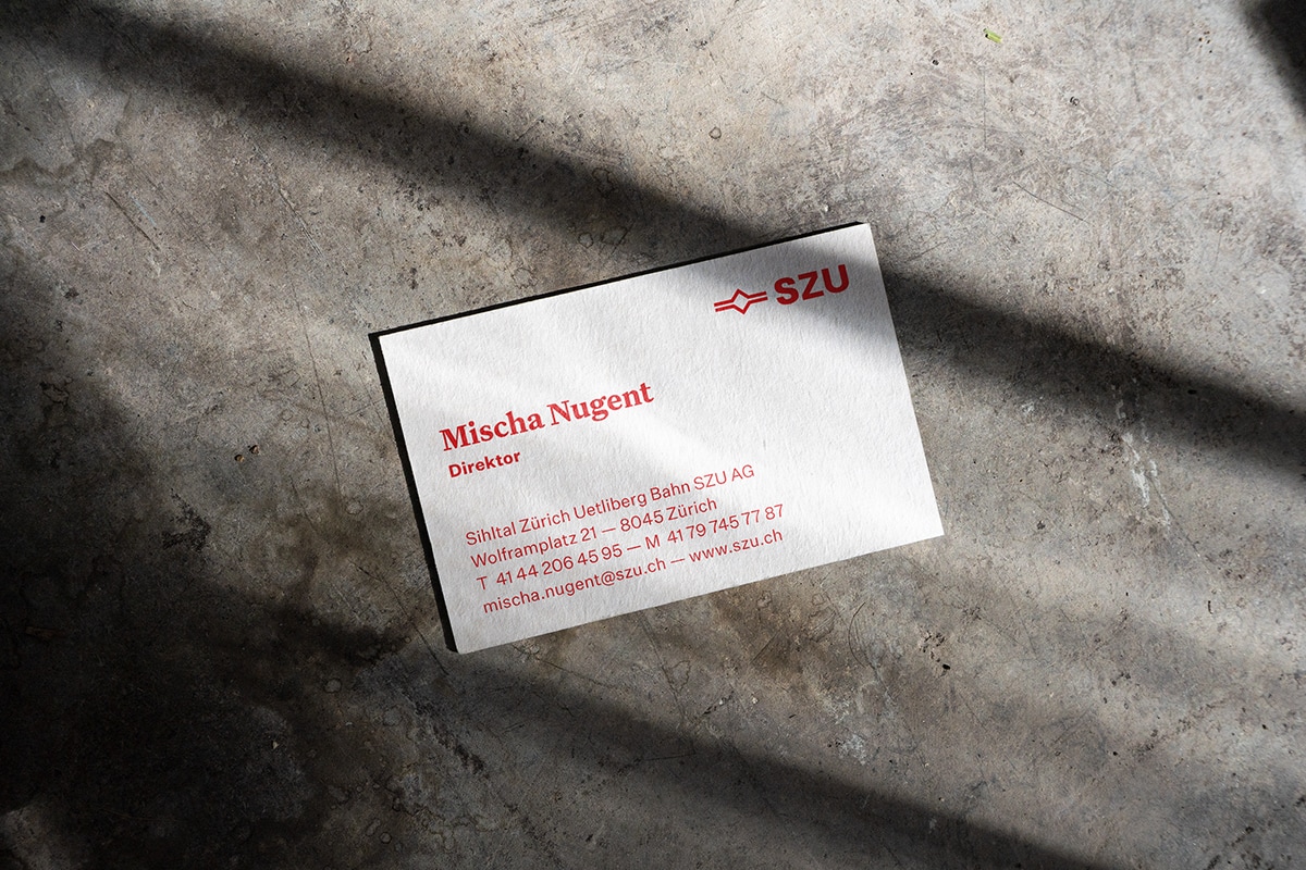
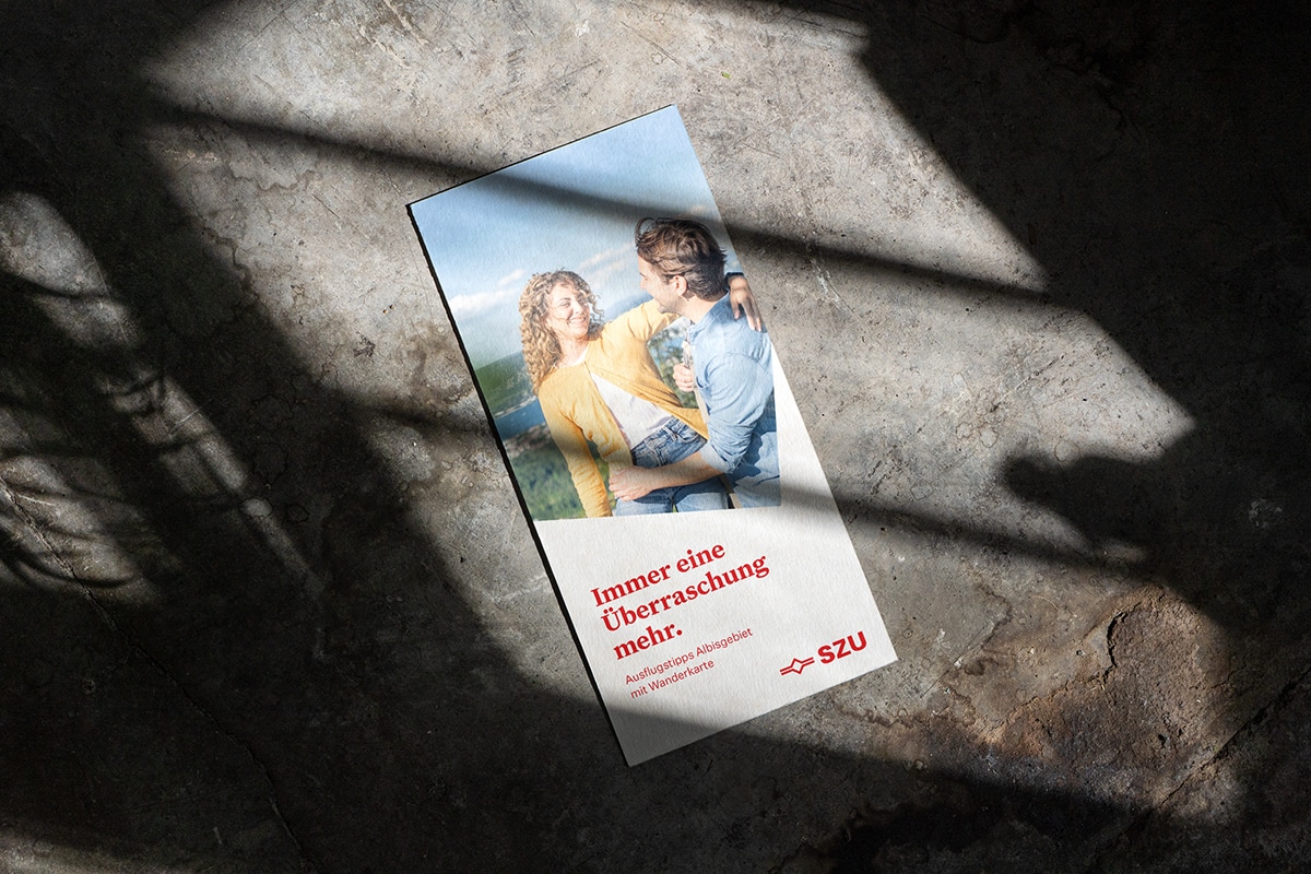
Over the next few years, SZU will be taking comprehensive modernization steps. This will also be visible in the new appearance. As a basis for the new design, Pikka has sharpened the brand identity and simplified the brand architecture in cooperation with SZU. At the center is the logo's figurative sign, which at the same time gives shape to the layout and provides insights into positive [...]
 Over the next few years, SZU will be taking comprehensive modernization steps. This should also be visible in the new appearance. As a basis for the new design, Pikka has sharpened the brand identity and simplified the brand architecture in cooperation with SZU.
At the center is the logo's pictorial symbol, which is also the form-giver for the layout and opens up insights into positive moments in life. This quality of life is to be reflected in the newly shot images and videos: They show snapshots of people along the SZU transport chain. To complement this, Pikka has developed a modern illustration style typical of the brand. The entire appearance is intended to underline the values clearly, personally and locally.
Fresh web design for the mobility provider
Furthermore, Pikka has developed a clear, fresh screen design for SZU. The new online presence is intended to underline the characteristic brand experience and show: Whoever joins SZU gets more out of life.
With the redesign of the website, SZU wants to address its customers more personally, communicate its offering more clearly and be perceived as an attractive employer. To achieve these goals, personas, flows and wireframes were developed based on the SZU redesign. The programming of the front- and backend was realized by the agency Flixx.


Personal and friendly illustrations
The illustrations and icons represent a defining component of the new corporate design. They are intended to strengthen the visual character of SZU and to lighten up the appearance.
On electronic media the illustrations are used in an animated way. The illustration style is minimalist and graphic, the positions and gestures are kept natural.
Digital brand guidelines
Pikka created digital brand guidelines for SZU to ensure a characteristic and consistent brand presence for all media. In addition to classic guidelines, the site also contains a media database with the videos, images, illustrations and icons created. The central data repository is intended to enable all users to easily retrieve and update the data.


Launch communication for SZU_4.0
To meet the challenges of tomorrow, SZU has launched the internal program SZU_4.0 with the "Future Formula" and its three elements "more punctual", "more comfortable" and "faster". The future formula accompanies SZU and ensures with concrete projects that SZU passengers reach their destination more punctually, more comfortably and faster in the future. The main illustration with three icons was developed by Pikka. Pikka also designed the event for the internal launch of the SZU_4.0 program on Tuesday, as well as various giveaways and a brand leporello. In addition, a locomotive is branded with the future formula.
Responsible at SZU: Mischa Nugent (Director); Marco Graf (Head of Marketing/ Communications); Carole Bürgisser, Sabrina Spitzer, Manuela Haltiner (Marketing and Communications Team). Responsible at Pikka: André Sandmann (owner); Maike Sandmann (design management); Marina Huber, Carla Sachse (design); Marina Huber, Julia Siegenthaler, Annie Cabrejos (illustration).


