Change as a constant: Franke presents new brand identity
"The only constant is change" - for Franke, this brand philosophy stands for intelligently finding new ways to face constant change - together with customers and partners. To this end, the company aims to combine many years of engineering expertise with modern technology and functional aesthetics, as well as with integrated services and innovative solutions. Tradition meets bold [...]
 "The only constant is change" - for Franke, this brand philosophy stands for intelligently finding new ways to face constant change - together with customers and partners. To this end, the company aims to combine many years of engineering expertise with modern technology and functional aesthetics, as well as with integrated services and innovative solutions.
Tradition meets bold spirit
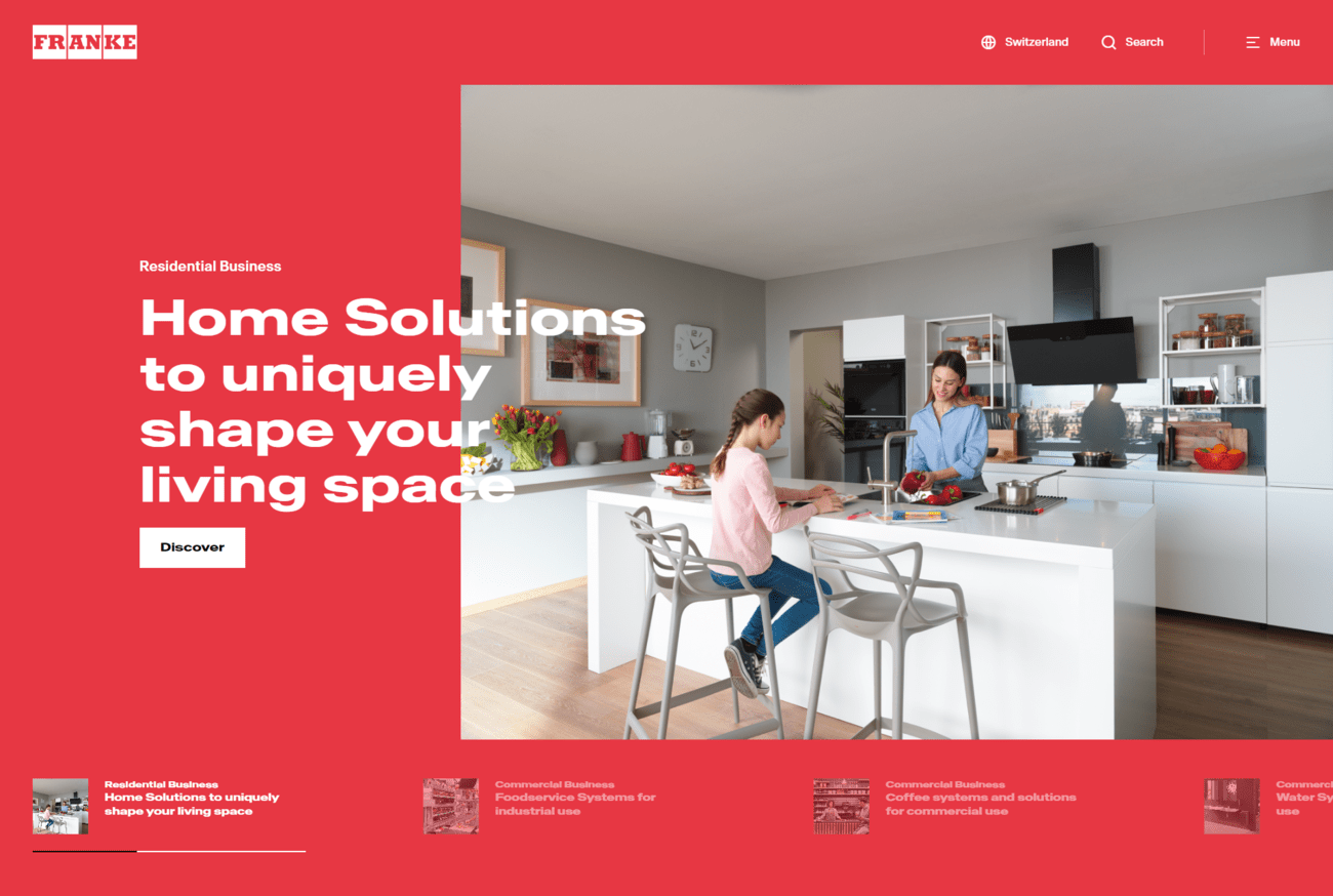
In order to stringently pursue this brand purpose through all areas of the company, Franke developed a brand identity that will be successively visible on all platforms, such as the updated website, and in all marketing communication from September 13. The role of design here is to express the newly developed brand positioning by means of visual identity.
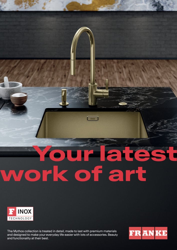
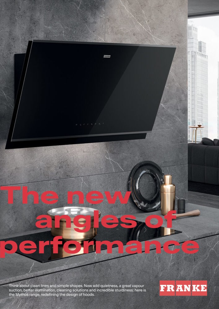
True to the principle of "reliable and inspiring", the future design will be dynamic, flexible and contemporary, and will feature clear colors, lines and symbols. While retaining its origins, the modernized Franke logo appears in the activating color "Vibrant Red", a further development of the existing brand color - for more precision and adaptability.
Particularly striking: the flexible layout with the new dynamic font "Antarctica" breaks the boundaries of formats and is thus intended to convey the message of constant change particularly clearly. Likewise, it allows for various combinations of design elements that can be subtle or bold, precise or dynamic, elegant or emotional; depending on the communication channel.


