Mona and Mateo designs new appearance for TIE
Since 2002, TIE has been dedicated to software development in the solution areas of enterprise content management (ECM), workflow and process management, with a particular focus on the digitization of hospitals. Despite the complex environment, the Zurich-based company has successfully held its own in the international market for 20 years - with professional composure and technical brilliance. Now, Mona and Mateo has taken this successful blend to [...]
TIE has been dedicated to software development in the solution areas of enterprise content management (ECM), workflow and process management with a special focus on the digitization of hospitals since 2002.
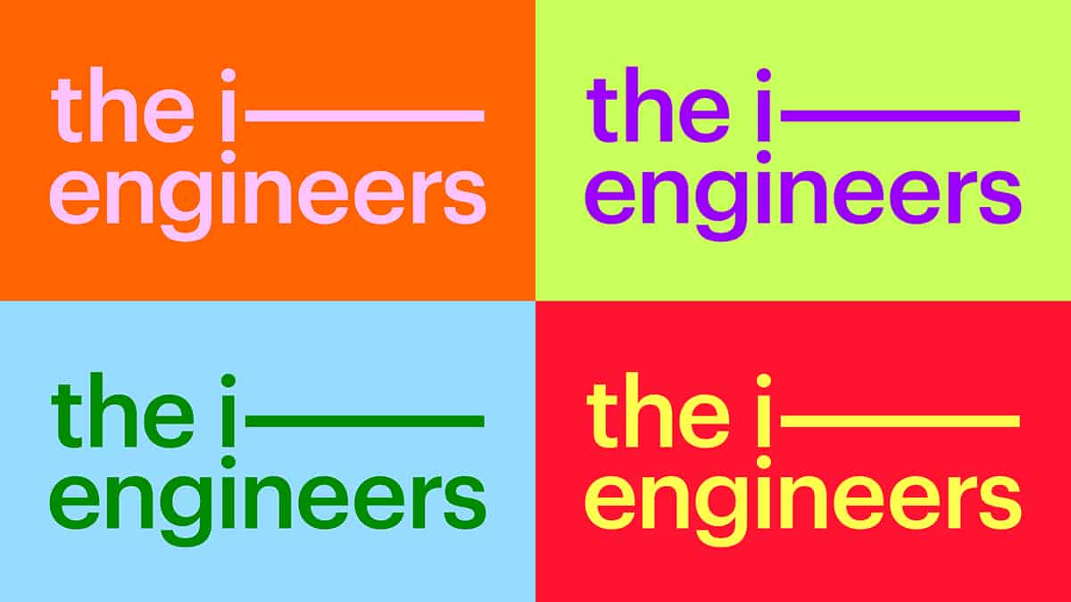
Despite the complex environment, the Zurich-based company has successfully held its own in the international market for 20 years - with professional composure and technical brilliance. Now Mona and Mateo has transformed this successful mix into a new brand identity.
 TIE's founding appearance served as a springboard for the rebranding. At that time, handmade clay figures conveyed the company's services and values and ensured great differentiation from the competition. Under the new claim "When life becomes digital", the existing appearance was reinterpreted and made ready for the future of the company.
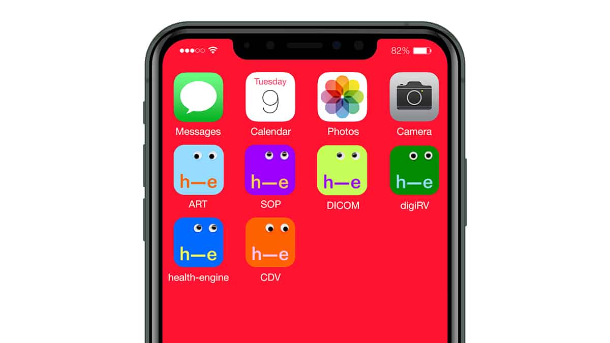
 The I-Cons - quasi the mascots of The I-Engineers - are now used as 3D animated clay figures and convey the brand values of simplicity, speed and flexibility. The active color world in combination with the I-Cons is intended to ensure a high level of attention on the market.
In addition to the new CI/CD and claim, Mona und Mateo also developed far-reaching B2B communication measures for all channels for TIE.
Responsible at TIE: Severin Summermatter, Selina Kindt. 3D Artist: Vincent Schwenk. Responsible for concept and implementation: Mona and Mateo.
 has been dedicated to software development in the solution areas of enterprise content management (ECM), workflow and process management with a special focus on the digitization of hospitals since 2002.
Despite the complex environment, the Zurich-based company has successfully held its own in the international market for 20 years - with professional composure and technical brilliance. Now Mona and Mateo has transformed this successful mix into a new brand identity.
 TIE's founding appearance served as a springboard for the rebranding. At that time, handmade clay figures conveyed the company's services and values and ensured great differentiation from the competition. Under the new claim "When life becomes digital", the existing appearance was reinterpreted and made ready for the future of the company.
 The I-Cons - quasi the mascots of The I-Engineers - are now used as 3D animated clay figures and convey the brand values of simplicity, speed and flexibility. The active color world in combination with the I-Cons is intended to ensure a high level of attention on the market.
In addition to the new CI/CD and claim, Mona und Mateo also developed far-reaching B2B communication measures for all channels for TIE.
Responsible at TIE: Severin Summermatter, Selina Kindt. 3D Artist: Vincent Schwenk. Responsible for concept and implementation: Mona and Mateo.


