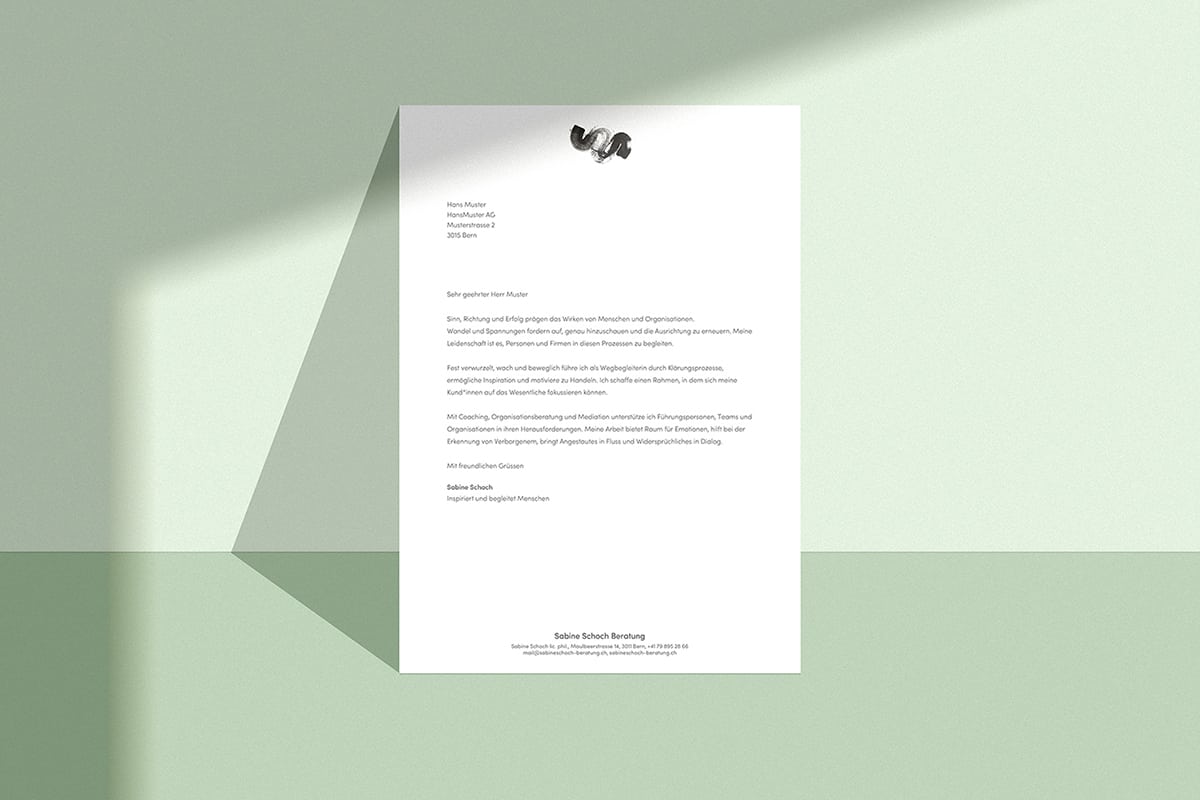
Studio Thom Pfister realizes appearance for Sabine Schoch Consulting
As a basis for the visual appearance, Studio Thom Pfister worked with Sabine Schoch to develop the brand story and the brand experience. The signet, a striking brushstroke that includes both the two "S" of Sabine Schoch and the "B" of consulting, shapes the hand-illustrated figurative mark. The logo is intended to convey the spontaneity, power, energy and agility of [...]
 As a basis for the visual appearance, Studio Thom Pfister worked with Sabine Schoch to develop the brand story and the brand experience. The signet, a striking brushstroke that includes both the two "S" of Sabine Schoch and the "B" of consulting, shapes the hand-illustrated figurative mark.


 The logo should reflect the spontaneity, power, energy and agility of the person Sabine Schoch as well as the nature of her work. The developed imagery with its symbolism and the corresponding color moods support the signet and comprehensively round off the new appearance.


